Tell me more, tell me more! In this post, we’ll look at how to use Tableau’s dynamic zone visibility to let users “zoom in” on dashboard elements to get to a more detailed view.
Pop-up boxes in Tableau can be used for filters, zooms, or extra information – and more! Dynamic zone visibility makes these pop-ups even more fancy by allowing multiple objects to be shown and hidden with one click. That lets us add image layers for extra formatting and a slicker user experience.
BANs (big numbers representing KPIs or other important info that pop out to users immediately) are a powerful tool in any dashboard creator’s arsenal. In today’s post, we’ll explore how you can use Dynamic Zone Visibility to make your BAN layout change as your dashboard changes.
Too many charts, too little dashboard space? In today’s post, the first in my series about use cases for Tableau’s Dynamic Zone Visibility, we’ll look at how to swap between multiple charts with a single parameter. (New to dynamic zones? Start here)
Dynamic Zone Visibility was added to Tableau in update 2022.3, and it’s one of the most powerful new features of the last few years. I’m going to be starting a series of articles about the many use cases for dynamic zones, from obvious to wacky. This first post will cover the basics of what they are and how to use them – if you haven’t used dynamic zones before, start here!
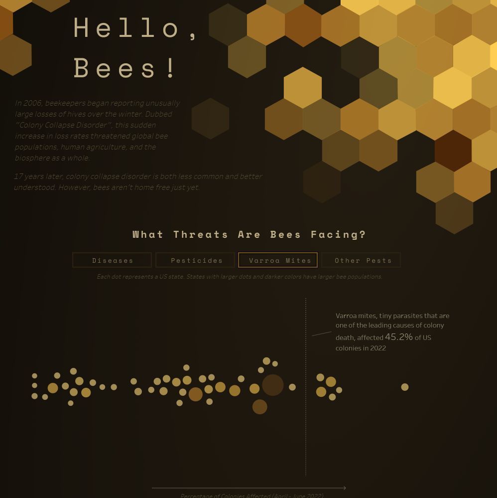
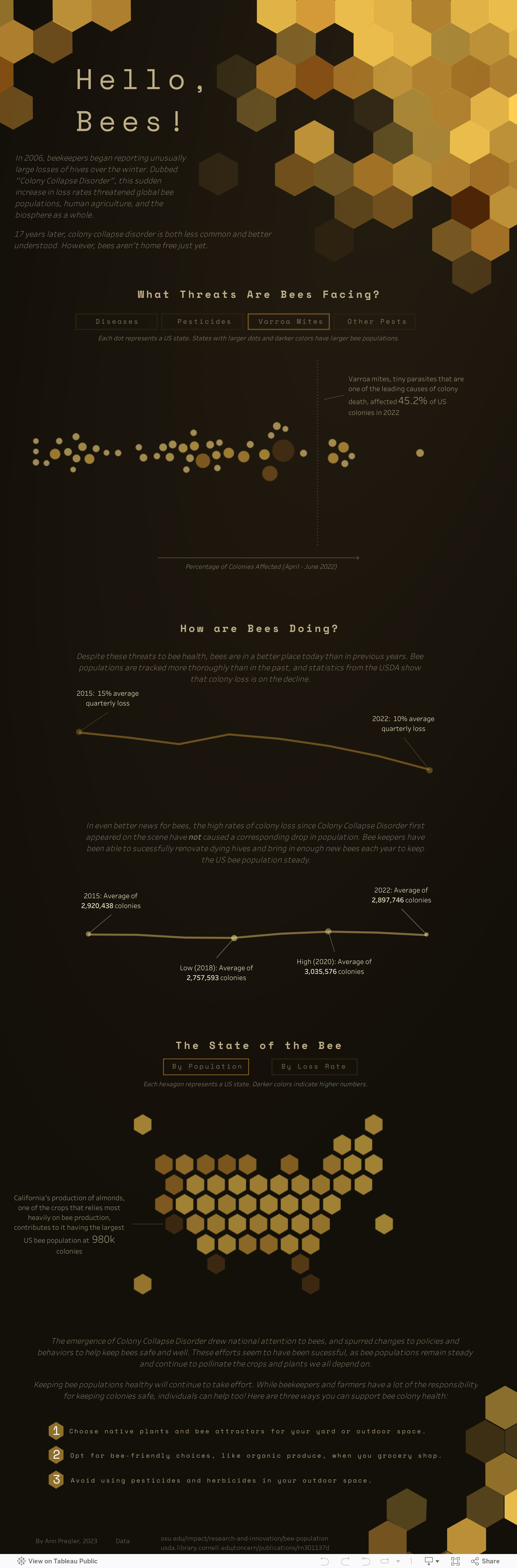
I designed this long-form visualization to explore the status of US honey bees in the wake of colony collapse disorder and other population threats. Tableau Public featured this viz as a Viz of the Day in March 2023.
The Level Up series is designed to take Tableau beginners from out-of-the-box functionality to the next level of design and analytics, and features tip and tricks to make your dashboards more professional and polished. Make sure to check out the other posts in the Level Up series before you go!
Ever wanted to change the size or filters when you put a viz into a Tableau tool tip? In this post, we’ll look at a couple quick ways to customize your viz in tool tip options.
I recently passed Tableau’s Data Analyst exam, and became a Tableau Certified Data Analyst! In today’s post, I’ll share my experience with the exam, what to prepare for (+how to prepare), and whether the certification is worth it.
The Level Up series is designed to take Tableau beginners from out-of-the-box functionality to the next level of design and analytics, and features tip and tricks to make your dashboards more professional and polished. Make sure to check out the other posts in the Level Up series before you go!
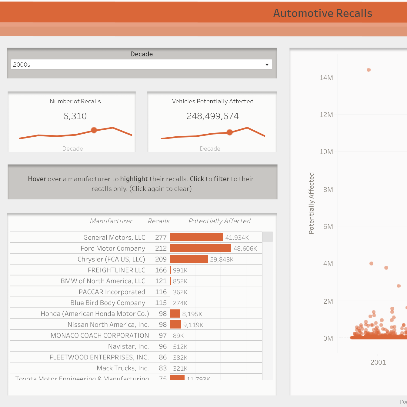
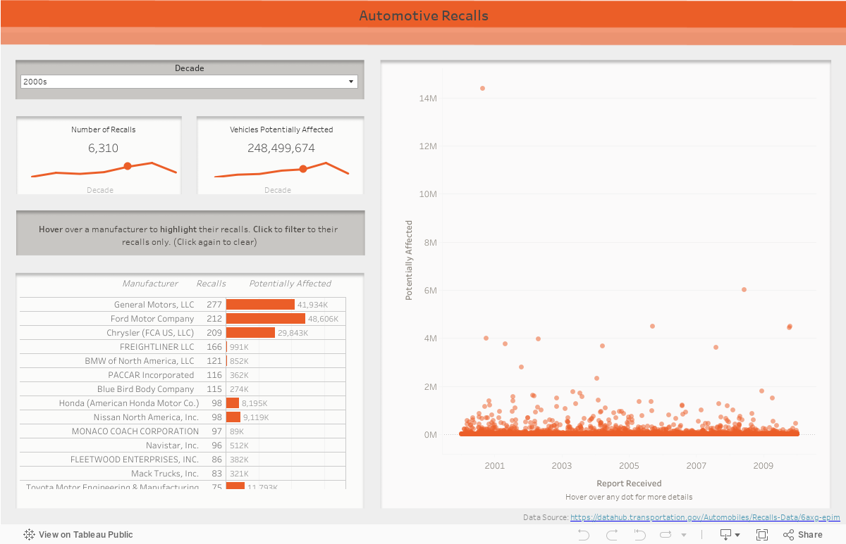
Tableau graphs allow you to add multiple mark layers, which has a surprising number of uses. Today, I’m going to demonstrate how to make a chart like the ones above. These charts show a time trend over multiple decades (using the line mark), but also call out the specific decade we’re looking at (using the circle mark). The circle moves when the decade parameter is changed, which gives the user a helpful “You Are Here” marker.
This visual shows automotive recall data from the 1960s to 2023. I created it for the 1/23/23 Makeover Monday community project, using data from the US Transportation Department.