Ann Pregler
Blog
Portfolio
Contact
Data Viz
,
Tableau
January 29, 2026
Map Insets in Tableau
Continue reading
: Map Insets in Tableau
Data Viz
,
Tableau
April 28, 2025
Why Is My Date Turning Into A Bar? (Tableau Troubleshooting)
Continue reading
: Why Is My Date Turning Into A Bar? (Tableau Troubleshooting)
Data Viz
,
Tableau
January 29, 2025
How I built This: Wellerman (Iron Viz Top 10)
Continue reading
: How I built This: Wellerman (Iron Viz Top 10)
Data Viz
,
Tableau
January 13, 2025
Why Is My Scatterplot a single point? (Tableau Troubleshooting)
Continue reading
: Why Is My Scatterplot a single point? (Tableau Troubleshooting)
Data Viz
,
Tableau
December 3, 2024
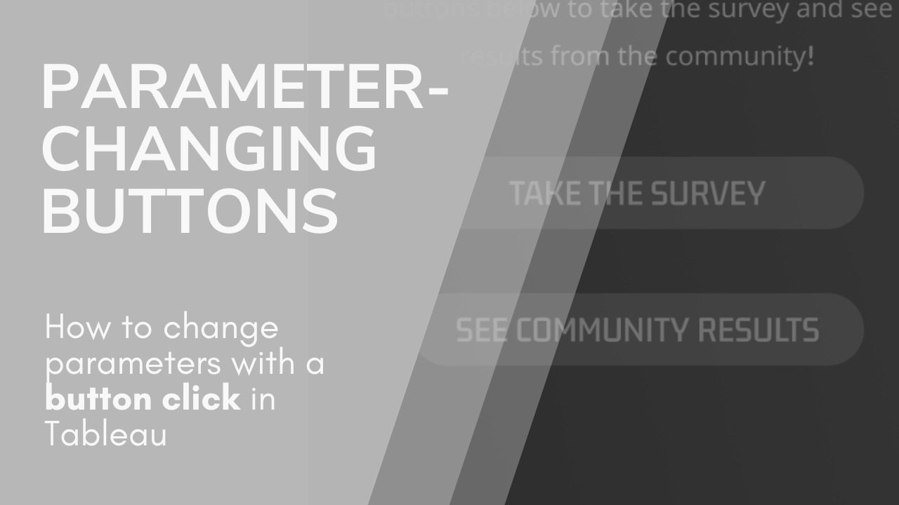
Parameter Changing Buttons
Continue reading
: Parameter Changing Buttons
Data Viz
,
Tableau
November 13, 2024
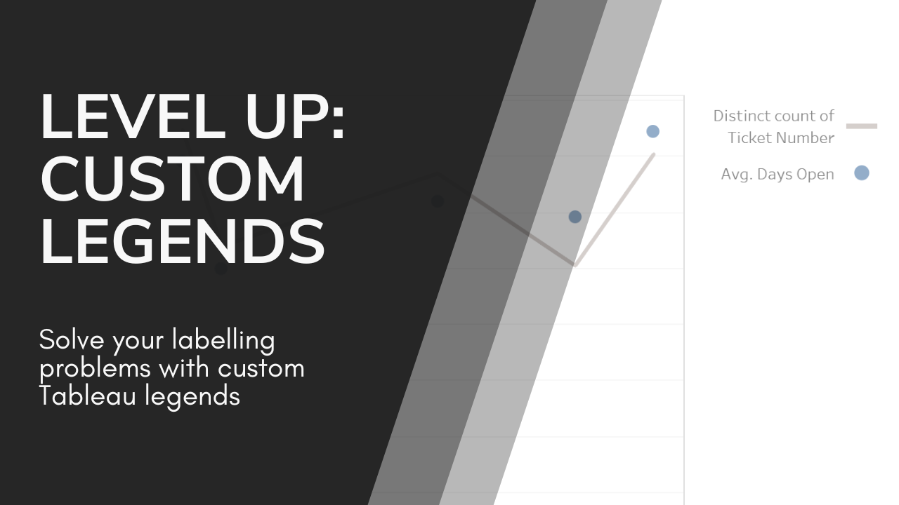
Level Up: Custom Legends in Tableau
Continue reading
: Level Up: Custom Legends in Tableau
Data Viz
,
Tableau
October 21, 2024
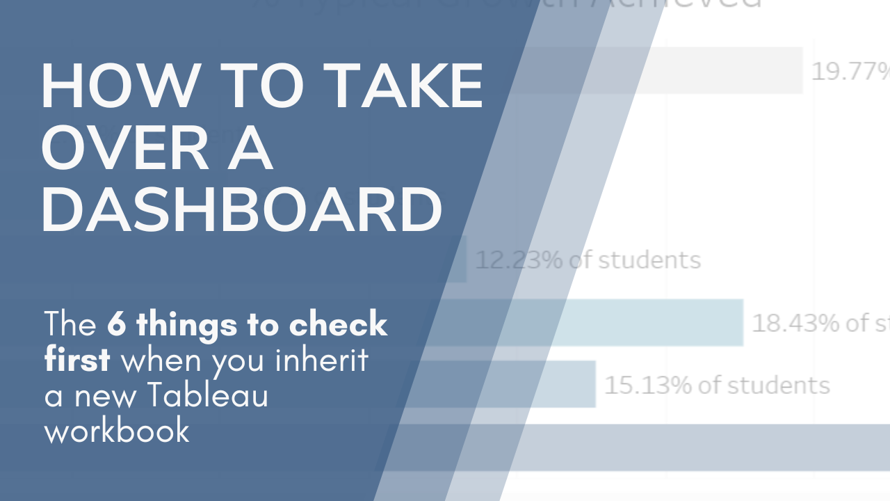
6 Tips For Inheriting a Dashboard
Continue reading
: 6 Tips For Inheriting a Dashboard
Data Viz
,
Tableau
October 15, 2024
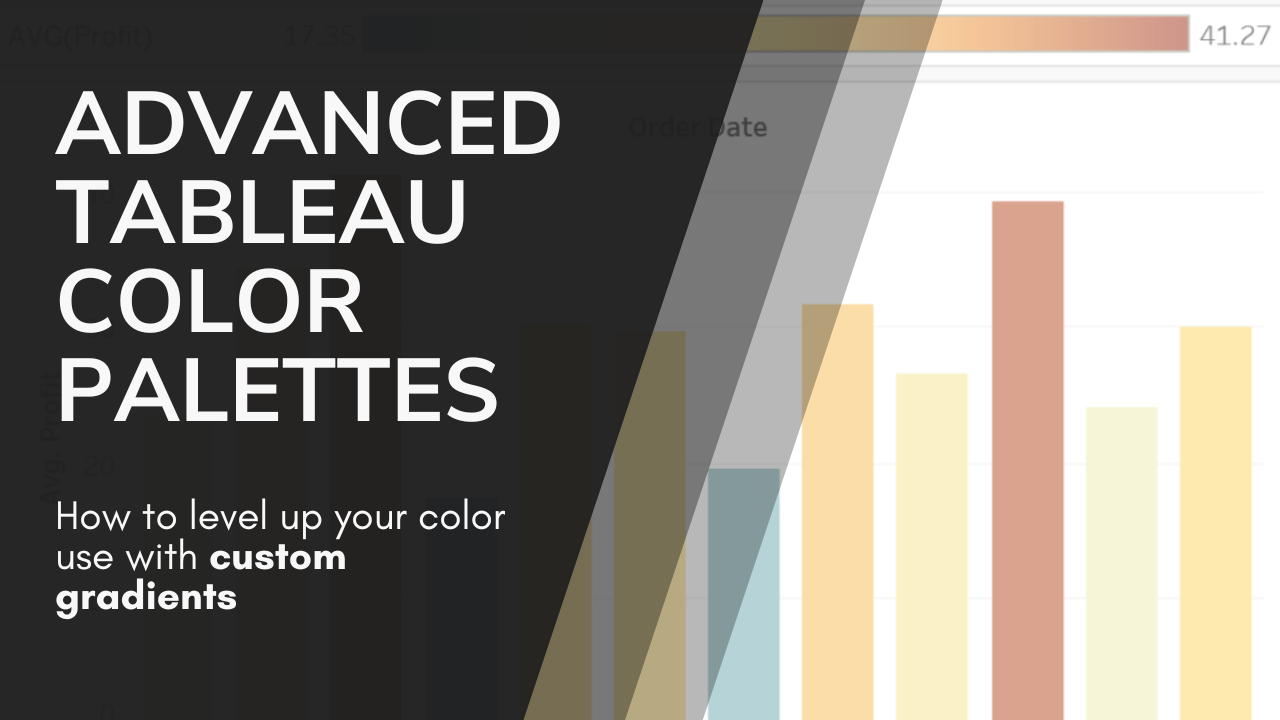
Advanced Tableau Color Palettes
Continue reading
: Advanced Tableau Color Palettes
Data Viz
,
Tableau
October 8, 2024
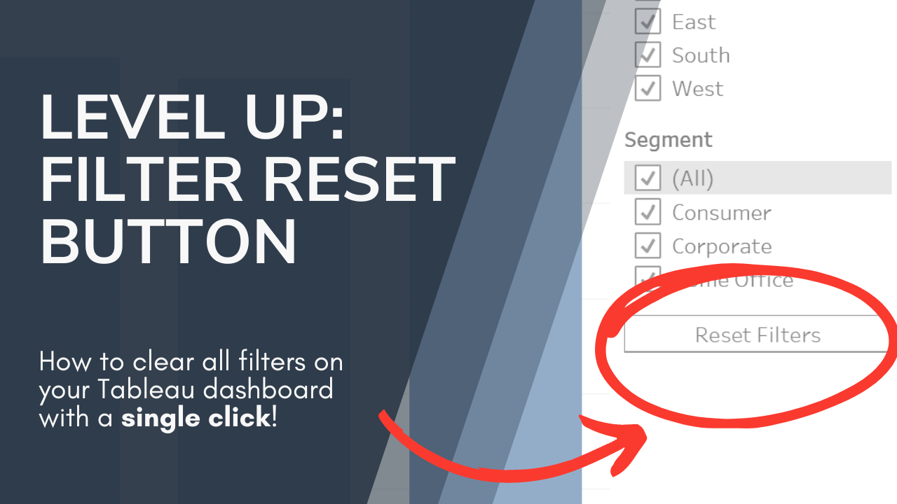
Level Up: ‘Reset Filters’ Button (With No Highlighting!)
Continue reading
: Level Up: ‘Reset Filters’ Button (With No Highlighting!)
Data Viz
,
Tableau
September 29, 2024
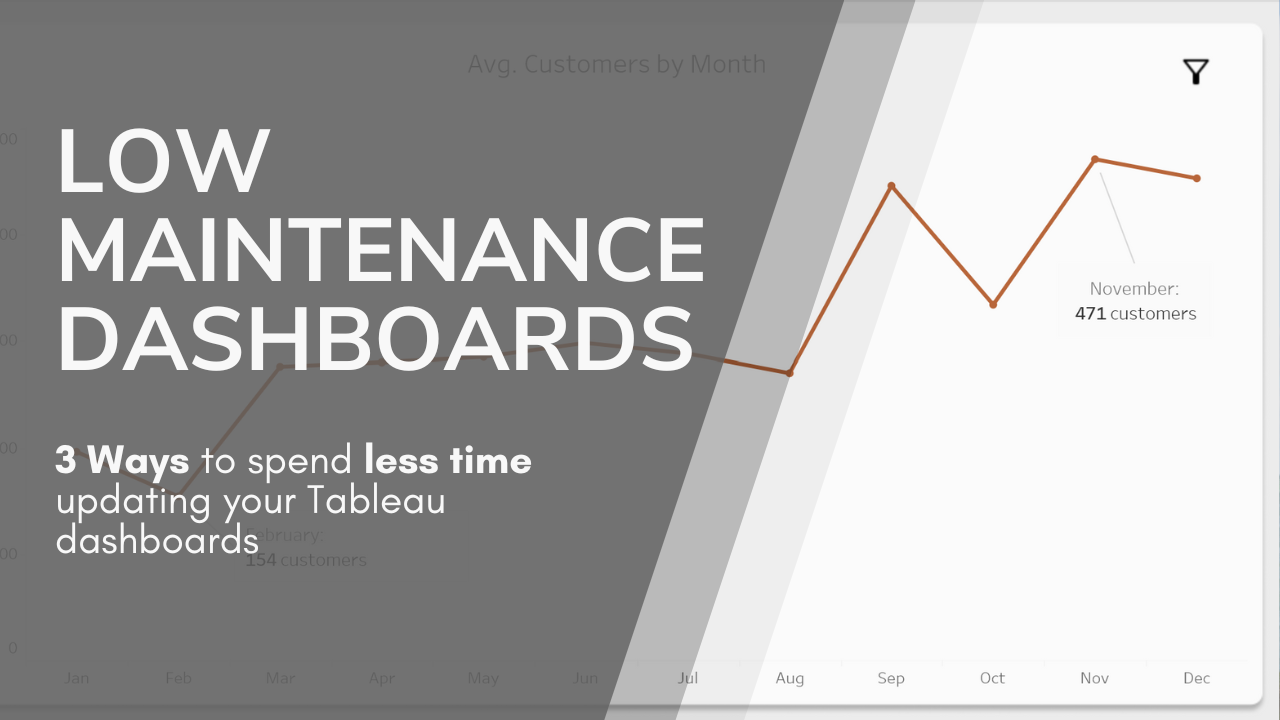
Building Low-Maintenance Dashboards
Continue reading
: Building Low-Maintenance Dashboards
1
2
3
Next Page
Notifications