Ann Pregler
Blog
Portfolio
Contact
Tableau
December 29, 2022
Using Icons to Change Parameters (With Parameter Actions)
Continue reading
: Using Icons to Change Parameters (With Parameter Actions)
Tableau
,
Uncategorized
December 29, 2022
Dashboard Help Overlays with Figma
Continue reading
: Dashboard Help Overlays with Figma
K12
,
Portfolio
December 27, 2022
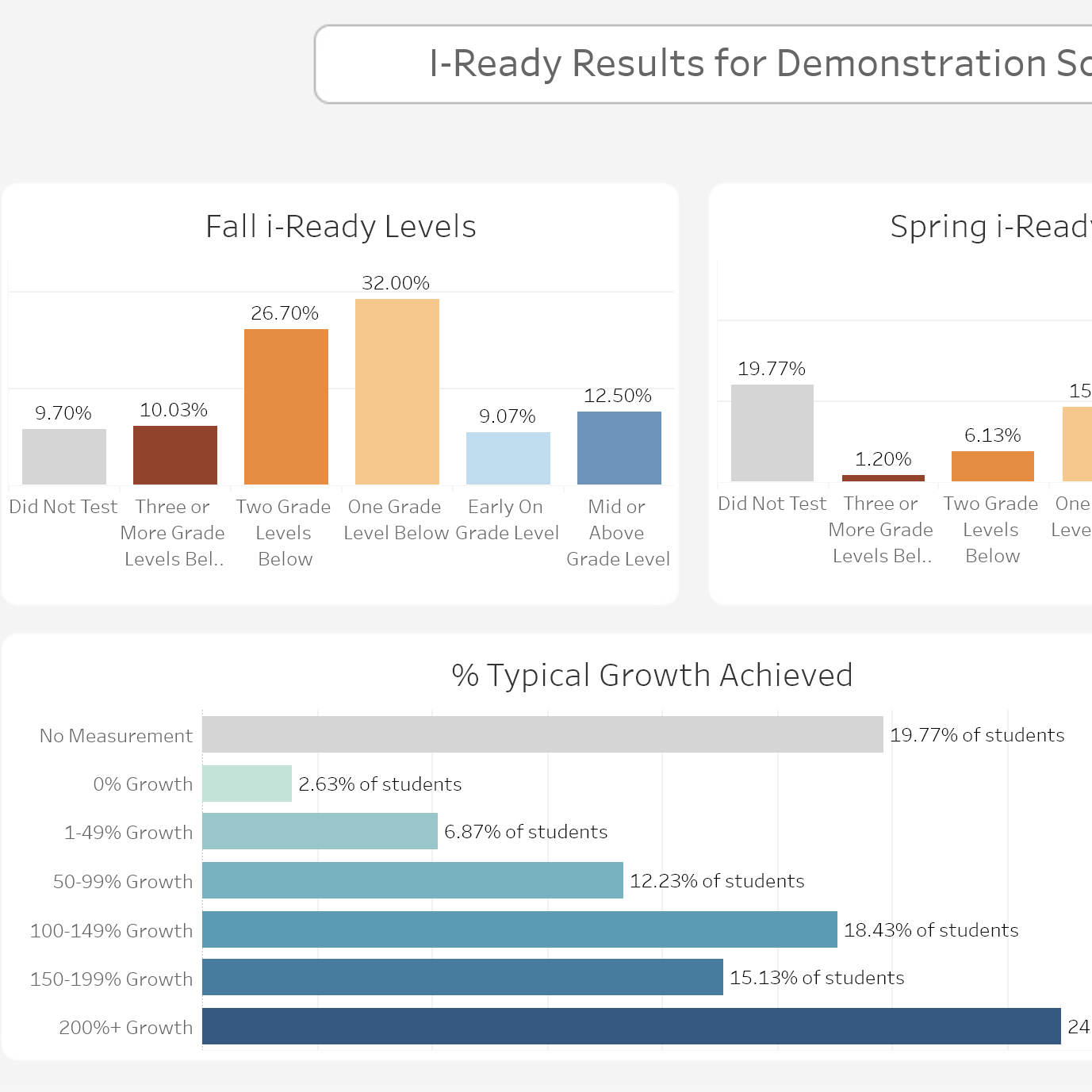
K12: Assessment Growth
Continue reading
: K12: Assessment Growth
K12
,
Portfolio
December 26, 2022
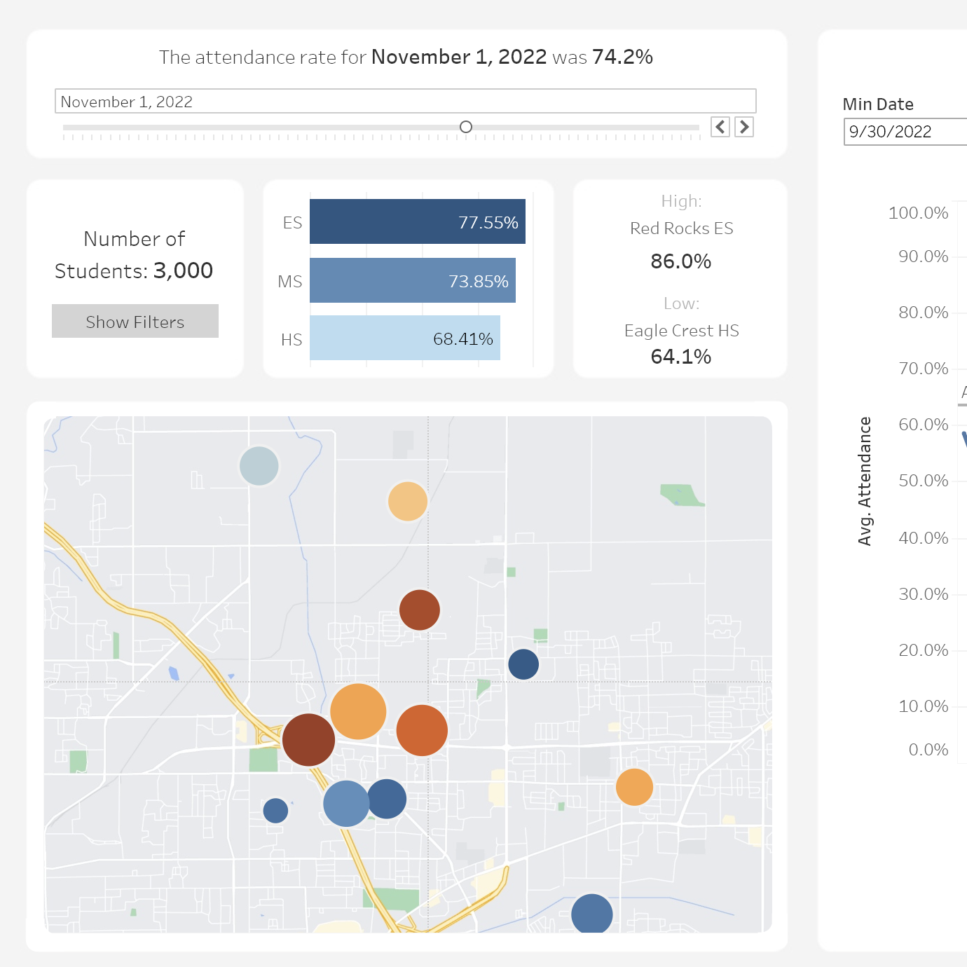
K12: Attendance
Continue reading
: K12: Attendance
K12
,
Tableau
December 26, 2022
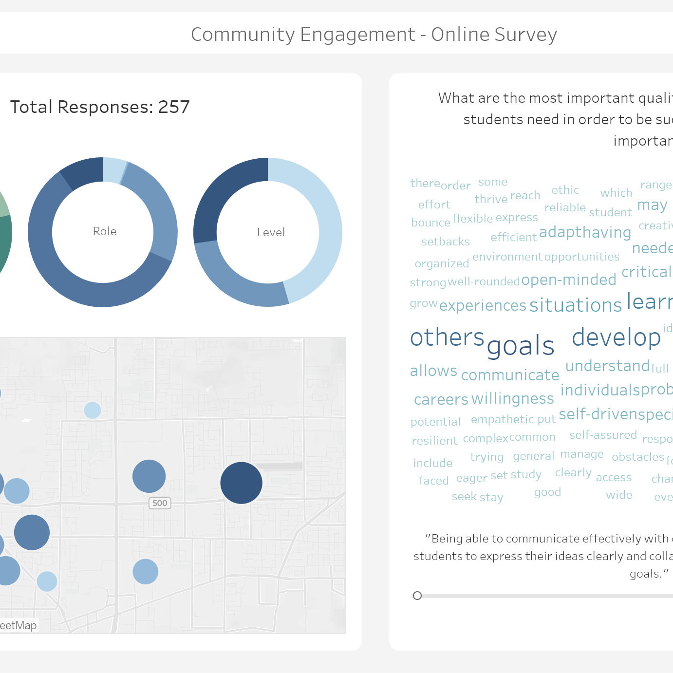
K12: Engagement Survey
Continue reading
: K12: Engagement Survey
Data Viz
,
Portfolio
December 26, 2022
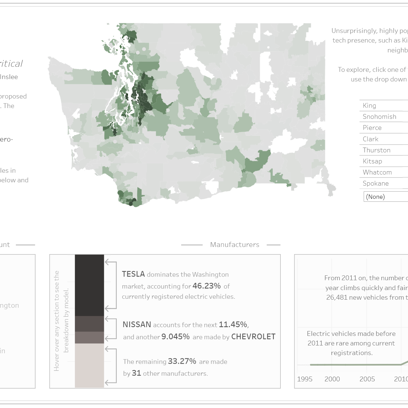
Electric Vehicles
Continue reading
: Electric Vehicles
Data Viz
,
Portfolio
,
Tableau
December 26, 2022
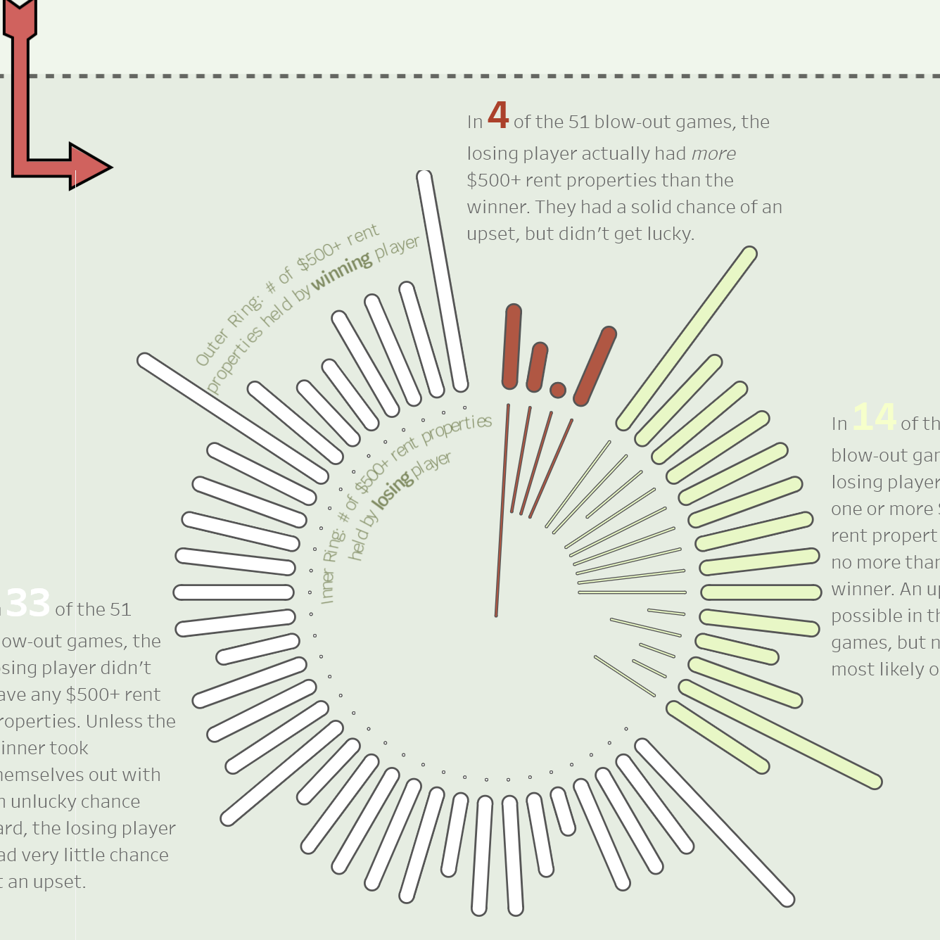
Monopoly (Iron Viz 2022)
Continue reading
: Monopoly (Iron Viz 2022)
Tableau
December 22, 2022
User-Friendly Spreadsheet Downloads in Tableau
Continue reading
: User-Friendly Spreadsheet Downloads in Tableau
Data Viz
,
Tableau
December 22, 2022
Embedding Surveys in Tableau Dashboards
Continue reading
: Embedding Surveys in Tableau Dashboards
Data Viz
,
Tableau
December 22, 2022
Filterable Word Clouds in Tableau (With Pivots!)
Continue reading
: Filterable Word Clouds in Tableau (With Pivots!)
Notifications