Tableau gives us a lot of control over how charts and visuals are displayed – size, position, color, opacity – but one thing is missing: Shape. In today’s post, I’ll show you how to create circular insets for maps and charts.
(Plus, I’ll show you a crazy bonus technique to make tooltips still work on insets like these).
Before we dig in, it’s important to note that this is really just a fun visual effect. It’s great for creative storytelling dashboards, where aesthetics are king. It’s probably not worth doing on business dashboards, where function is more important than form.

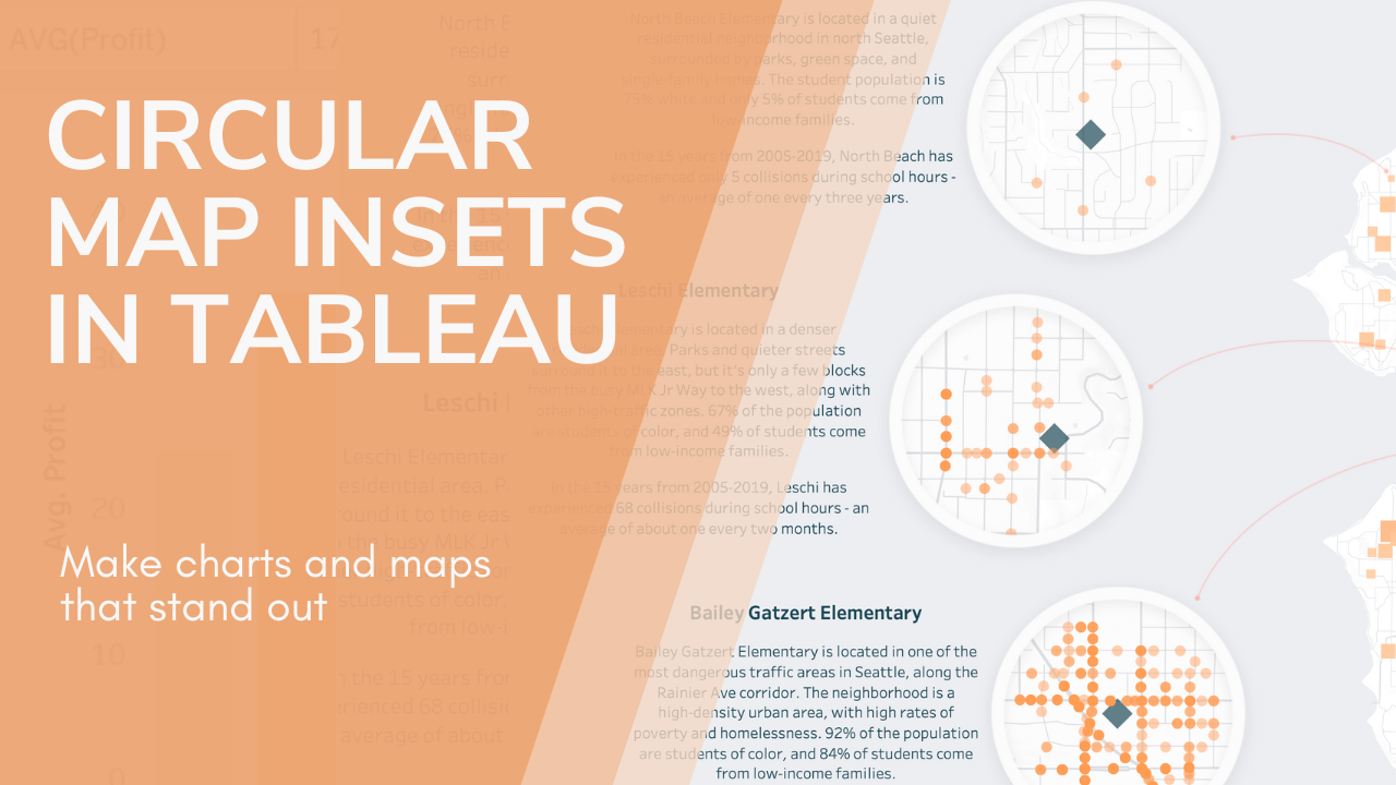
For this post, I’ll be using map insets from a dashboard I built about traffic collisions near schools in Seattle. (Not on Tableau Public yet, but will be coming soon). My goal was to provide a “zoomed-in” view of collisions around three specific schools, without losing the context of the bigger Seattle map.
Since zoomed-in insets are a really common feature of maps, this is an intuitive way to show what’s happening. You could also use these to embed charts in circles, or in any other shape of your choice. Here’s how to make them!
Step 1: Prep Your Charts and layout
The key to this process is a background image with transparent sections. Before we can get that background set up, we’ll need to make sure our charts are in order. Here’s what my dashboard looks like without the background:

(Tip: You’ll need everything to be floating or in a floating container for this to work)
Not so pretty! I have four maps visible – one large on the right, and three small – each of which are their own sheets. I’ve made sure that the inset maps are large enough to fully fill the circles I plan to add. It’s ok if there’s spillover and overlap, because the edges of the square inset maps won’t be visible after the circles are in.
I had a really specific vision in mind for these maps, so created the base maps using MapBox and imported them. The large map on the right will need to blend seamlessly into the background, so I made its “water color” the same grey that I’ve chosen for the background.
(Tip – you can also just use the default Tableau map styles! Making the water color blend into my background was an bonus style choice for this dashboard, not a necessity for making the insets work).
I’ve also added a couple curved orange lines to link the insets to the main map. These were just drawn in Figma and imported as floating images.
Try to get your layout as close to final as you can. This will be annoying to change later.
Step 2: Create your background image
Now it’s time to head over to Figma, or the graphic design tool of your choice.
Take a screenshot of your current dashboard layout and import it. Then size it up to match the actual dimensions of your dashboard:

Next, we’re going to create the overlay that will act as the “background” for the dashboard, by adding a filled rectangle on top of this screenshot. You have two choices here:
- Create a full background that will cover the entire dashboard. That’s what I chose for my dashboard, because I wanted an image background anyway for some other elements outside of this section.
(Note: My dashboard is long-form, so the background rectangle I drew is bigger than the screenshot. Your background might cover the full screenshot.)

- Alternatively, you can make a small background “patch” that is just big enough to cover the map or chart. This works nicely if you’re planning to use white or a Tableau color-fill for the background of your dashboard, and aren’t planning to bring in a full image background.
Make sure to match the patch color to the planned background color of your dashboard.
Here’s what this approach would look like for my top left map:

Step 3: Cut a hole
Time to cut out the space our map will actually peek through! I’ll demo this in Figma, but most graphic editors will have similar functions – you might just have to poke around or do some googling to figure out exactly how yours works for boolean operations and subtractions.
Start by drawing a filled circle on top of your background rectangle in the spot you want to be cut out.
(Tip: You can temporarily reduce the opacity of the background rectangle to help you figure out where to place the circle, as I’ve done in the screenshot below.)

Select both the circle and the background rectangle.
(Tip: Hold shift or control/command to multi select).
Then go to the “boolean operations” dropdown (in the right-side design toolbar), and choose “subtract”.

This will subtract the circle from the background rectangle, and leave a cut-out hole on top of our map location! When I increase the opacity of the background back to normal, we can see the map peeking through.

Repeat the process for any other holes you want to cut out.

Step 4: Decorate (if desired)
This is also the time to add any decorative elements to your inlays that you would like. For mine, I opted to create a thin donut border with a drop shadow, to give the maps a framed effect.
(Tip: To create this donut shape, lay a big circle and a slightly smaller circle on top of each other, and use the same “subtract” tool we used in the previous step).

Step 5: Export and Add to Dashboard
Start this step by deleting the screenshot you used to line up the cut-outs.

Then select everything left on the page and group it.

Use the “export” tool (the last option in the right-side “design” toolbar) to download this group as a png.
Now let’s head back to our dashboard! Add the png you just downloaded to the dashboard as a floating image object, and make it the correct size. If you chose to make a full background, it will cover the full size of your dashboard. If you made a “patch”, it should be just big enough to cover the map you’re insetting.
If you made your background accurately, you should already see your maps poking through the cut-out holes!

Step 6: arrange the layers
Here’s the key to this technique: The floating objects on the dashboard need to be arranged in layers.
- Bottom layer: The inset maps or charts
- Middle layer: The background image we just downloaded
- Top layer: Everything else
The easiest way to handle this is to start by right-clicking your background image in the layout sidebar, and choosing “send to back”.

THEN (order matters here), do the same thing to each map or chart you want to inset.
This will leave you with everything stacked in the correct order, and a beautiful dashboard with insets!

Optional step: Use an invisible layer to enable tooltips
This step is absolute overkill, but if you’re a perfectionist, read on!
The downside to the method I’ve described so far is that because there is an image on top of the inset maps, tooltips will not work on them. (The fact that parts of the image are transparent doesn’t matter – the image is still there.)
If tooltips are essential to your use, one option is to float an invisible copy of the map – perfectly aligned – above the inset. The visible sections will be below the background image, and the tooltips will come from the invisible copy above the background.
To do this, start by duplicating the inset map sheet and adding it to the dashboard.

Go to the copied map sheet, open the “Map” -> “Background Layers” menu and uncheck all layers.

Open the format menu (right click on the map area and choose format), and change the background color to “none”.

Set the opacity of all marks on the map to around 20%-40%.

Go back to your dashboard and adjust the position and size of the map until the semi-transparent marks perfectly line up with the marks underneath. This is easier with charts, where you have full control of the axis – with maps, the zoom makes it an absolute pain. Sorry.

Return to the sheet and set all the marks to full transparent (0% opacity). And you’re done!

(Tip: Right-click the map and choose “map options” to disable all the zoom, pan, etc, controls so that this map doesn’t get moved).
That’s it for today! I hope you enjoyed this post, and that some fun inset maps are in your Tableau future.
Leave a Reply