When you click a mark in Tableau, it often automatically greys out the other marks in the view. However, sometimes you need more control over what gets greyed out, or want to extend the effect beyond the limits of a single sheet.
In this post, we’ll look at how dynamic zone visibility can be used in Tableau to grey out full sections of a dashboard. This helps guide your users’ attention to the key information, and reduce distractions as they drill down into the data. This post is the 7th in my series of dynamic zone visibility use cases – make sure to check out the others if you haven’t seen them yet!
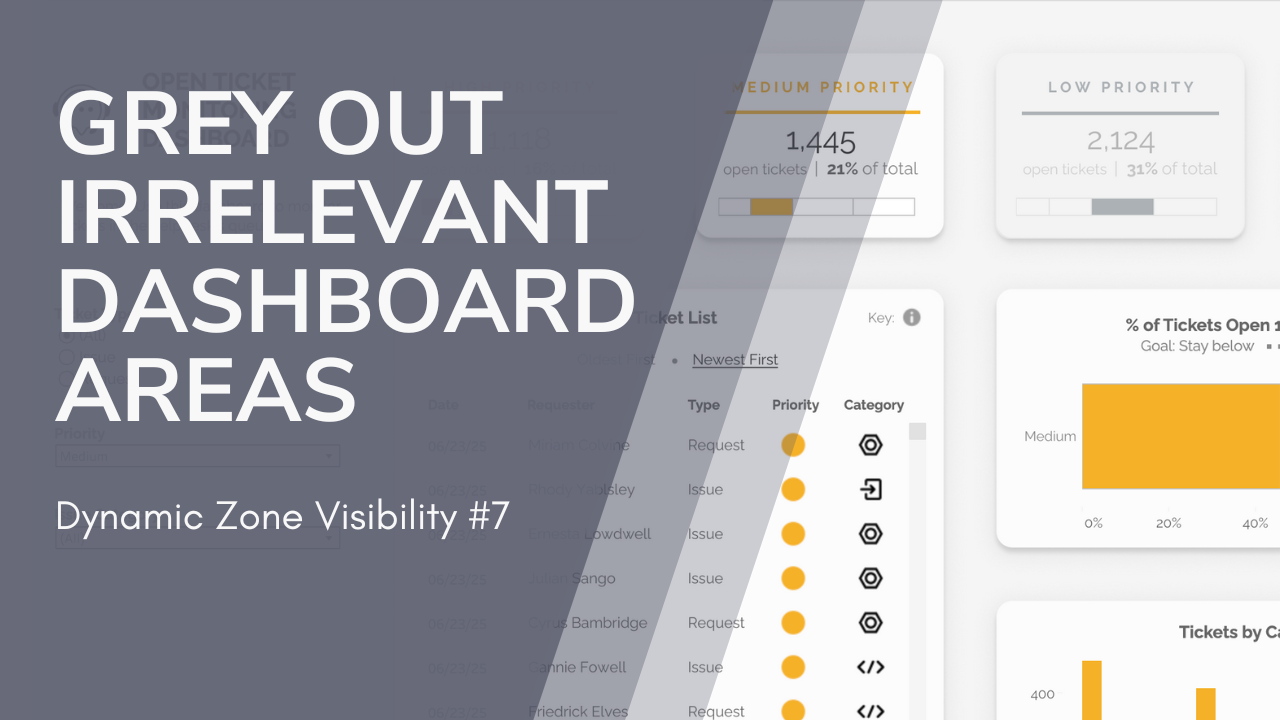
I’ll be demonstrating this technique using my Helpdesk Dashboard. In this dashboard, I used dynamic zone visibility to keep the user’s focus on the selected priority level.
When you choose a priority level using the parameter in the sidebar, the other three KPI cards grey out. If “All” is selected for priority level, then all KPI cards are fully visible.

Here’s how you build it.
1. Create a Parameter
Set up the parameter that you want to use to control the grey-out effect. Note that this has to be a parameter; if you were planning to use a filter, you’ll need to use a parameter-based calculated field.
(For example, I’m also using the priority parameter to filter my visuals. The filter is based on a calculated field, set to “[PriorityLevel]=[Priority]”, where Priority Level is the field in the data source and Priority is the parameter.)
Here’s my Priority parameter:

2. Create Calcs To Control SHaded Areas
Now you’ll need to create a set of calculated fields that manage the greyed out areas on your dashboard. You’ll need one calc for each area (or each group of areas with the same conditions).
Each of my KPIs has a different condition for being greyed out. For example, the “High Priority” card should be greyed out if the priority is Medium, Low, or Unknown. The “Medium Priority” card should be greyed out if the priority is High, Low, or Unknown. Because the conditions vary for each KPI, I’ll need 4 different calculated fields – one for each.
Here’s what my field for “Hide High Priority” looks like. This will return TRUE any time the high priority card should be greyed out – that is, any time the priority isn’t “High” or “All”. (I could also have written this as “[Priority] in (“Low”, “Medium”, “Unknown”)” for the same effect.

My other 3 calculations follow the same pattern.
3. Create a Semi-Transparent Shape
Now, let’s make the shape that will overlay areas on your dashboard to grey them out. You can use any drawing program that you like – I used Figma.
Create a shape (or multiple shapes, if you’re greying out differently shaped areas) that matches the size and shape of the area you want to hide. I like to do this by taking a screenshot of my dashboard, adding it to the program, and then drawing the shape on top of it.
Once your shape is correct, give it a grey fill and set the opacity to 70%. Export/save the shape as an image.
(Tip: If the area you want to grey out is a rectangle without rounded corners, you could skip creating an image and just use the “Blank” object in Tableau with a semi-transparent background).
4. Float The Shapes On The Dashboard
Add your shapes to the dashboard using an image object. (Or, as above, a blank object if you just want a standard rectangle.)
Make the objects floating, and position/size them so that they exactly cover the area you want to hide.

5. Add Dynamic Zone Control
Select each shape, and set “Control visibility using value” to the field you created to control that zone.

That’s it!
Add a control for your parameter, and test it out! As you change the parameter, the greyed out zones should change.
You could also add dashboard actions to let users control the parameter value by clicking on the dashboard. You can even add a button to control the parameter – check out my post about that here.
Enjoy!
Leave a Reply