The Iron Viz 2025 Qualifier results were announced a few weeks ago, and I was delighted to learn that I had placed 5th globally! Making it to the top 10 was a huge achievement for me, and – more importantly – I learned a lot along the way. (And I had a great time building my viz!)
In today’s post, I’m going to walk through the elements of my entry, Wellerman. I’ll discuss some of the technical tricks I used, and the design challenges that I encountered. While this won’t be a tutorial (that post would be a full novel), I hope it’ll help provide some insight into the process and inspiration for your vizzes.
(I also joined Louis Yu on his “Secrets of the Viz” Youtube series to talk about this viz – if you want to hear more from me about the inspirations and process, check out the episode here!)
Throughout this post, I’m going to assume that you’ve seen the viz – if you haven’t, you can find it here! This is going to be a long one, so maybe grab some popcorn before you read on to the next section.
The Big Picture: Topic and Layout
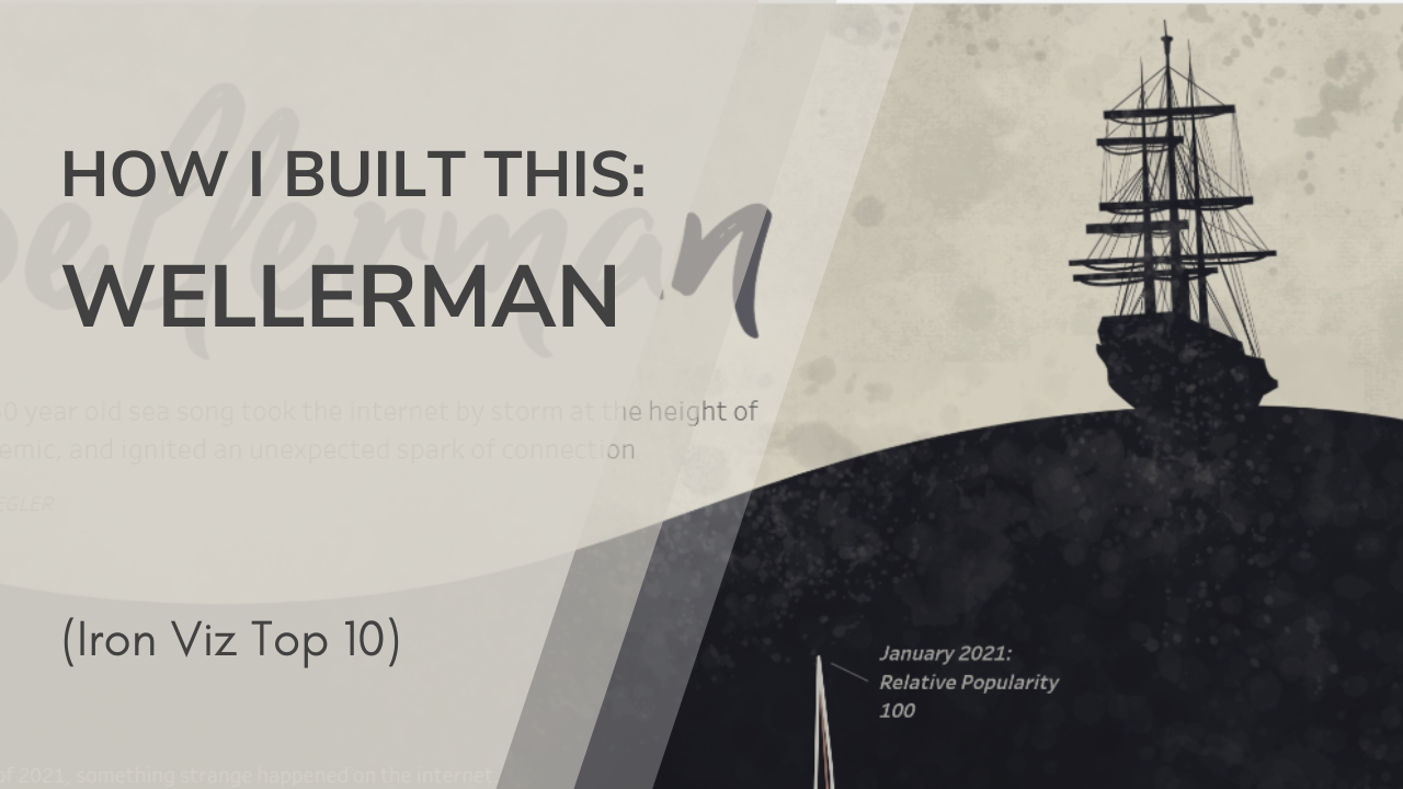
The hardest part of this year’s competition for me was choosing a topic. I waffled for weeks, starting on new idea after new idea only to toss them out after a day or two. Finally, I locked in on an idea that drew on my love of traditional folk music: The unexpected viral “sea shanty” trend that popped up during the pandemic.

I think that the strongest story telling starts with a strong question. And it’s important that the question isn’t forced or contrived – for a great story, it has to be a question that genuinely makes you wonder. I knew I had the right topic for my viz when I landed on a question that made me say, “Wait, what the heck happened there?” Antique sea songs going viral on TikTok definitely ticked that box!
Once I had my question, the story started to come together. I refined it and narrowed it down a lot. Originally, I planned to look at a story with a much bigger timeline, starting with the history of sea shanties and going all the way through how the traditional music genre has been affected by its newfound popularity. However, as I started to build, I realized that I needed to narrow my focus significantly. I chose to focus just on the pivotal moment of the story – the song going viral on TikTok – and the factors that impacted that one moment.
Even with this refinement, the second challenge I faced was space! My viz is wildly oversized, maxing out Tableau’s height limit at 10,000 pixels. Even with that huge vertical area, I still struggled to fit all of my story beats in while maintaining the design that I wanted. I wanted to make heavy use of negative space to separate story elements, and evoke a minimalist fill, but ended up having to squish everything closer together to fit in everything I wanted to include.

I settled on a monochrome theme early on, and actually created the background/header image before starting any of the data work. (I firmly believe in going with what inspires you!) This is what my background design inspiration board on Figma looked like:

While my final design wasn’t a copy of any of these inspiration images, you can see the journey from inspiration to result pretty clearly.

I drew the background image in Affinity Designer on my iPad, using an image of a whaling ship from WikiCommons as reference for the ship. I applied some texture overlays to give it a weathered look, and exported it to use as a background for the viz.
Section 1: Intro and Timeline
In the first section of the viz, I introduce readers to the sudden viral interest in Wellerman, and what the song is actually about. I had to juggle a couple things here – catching readers’ attention, sparking curiosity, introducing people who don’t know the song to it, and maintaining interest for readers who were already familiar with the genre.

The first graph, showing Google Trends data, is very simple. The biggest design choice here come from bringing in a third color, red. I initially wanted to stay fully monochrome – however, line weight alone just wasn’t enough to distinguish the lines. I also used annotations here to mark key months and provide the scale for the graph, eliminating the need for a vertical axis.
(Side note: I’ll admit that I was thrilled when I opened the Google Trends data for the first time and saw just how dramatic that spike was! It’s a great attention catcher.)
Another fun element in this section is the “Audio Player” component, which repeats several times during the viz. I used Spotify’s preview player, but didn’t love how it looked solo – plus, I wanted to give more options to listen to the full song for non-Spotify users. I designed this component in Figma, and used action buttons with invisible shapes to make the left-side buttons functional.
(These buttons use a link action instead of a parameter change, but otherwise work the same as the buttons in that linked post.)

I stuck with another simple visual to show the progression of the viral moment – a timeline. This is a dual-axis chart, with one layer as a thin bar chart and the other a circle mark type. The x-axis is “Date”, and the y-axis is a dummy calc field with a value of 1. All of the labelling is done using annotations, which is a bit of a pain in Tableau! I fixed both the x and y axis at longer lengths to allow some extra space for the annotations on the sheet.

The last trick in this section is the FAQ box, which gives a way for readers to catch up on the background of the song without losing real estate on the dashboard or boring readers who already know the song. Each bullet point here is its own sheet, and all of the details are written in tooltips.

Section 2: The Song

(This quote divider has no tech features or tricks, but I wanted to call it out before we move on because I love how these came out. Using quotes to divide the sections provided exactly the level of structure I was looking for.)
In this section, I started to dig into some more unusual chart types. (Or maybe more accurately, some more unusual uses of basic chart types – all of these charts are just scatter plots and bars, but none of them are used conventionally.)
The first chart, which breaks down the structure of Wellerman and some other songs, is a modified Gantt chart.

I used the Gant chart type, but took the bars down to the thinnest possible width to create a line feel instead. In order to get each song’s chart so compressed, I actually split this into four separate sheets (one per song), and added padding between them. This kept the lines very close together.

For the next chart, which shows the range of notes used in Wellerman and other songs, I leaned heavily on data modelling in Excel. In my data source, each note-song combination has one row. Then the third column indicates whether or not the note is in the range of the song. This let me make a simple chart with note on the rows shelf (there are actually a couple fields here – one is note number, which is used for ordering, and then two fields for note name) and song on the columns shelf, using a shape mark type.
This chart went through several iterations. I originally had a design that was more reminiscent of a stacked bar chart, which started at lower C. However, I (and my testers) found that it looked too much like a bar chart, and made it seem like starting at C was significant. What I really wanted to highlight wasn’t the starting point – it was the number of notes in the song.
To deal with that, I changed the shape to a circle instead of a thin rectangle, added a note of padding at the bottom of the scale, and added the arrow notation at the right to specifically call out how range is notated.

The second-to-last chart of this section is another unusual use of a common chart type. This is functionally just a scatterplot, with note number on the rows and time on the columns. I hid the x and y axis, and used reference lines to call out note positions and make the visual look more like a musical staff.
Section 3: Welcome to the internet
In section 3, I explored the actual path took to go viral on TikTok. This chart is the big-hitter of the whole viz, and took a huge portion of the time.

I have a much more detailed post about the creation of this graph here. At its base, it’s a network chart, which I created using LaDataViz’s network generator. There are four copies of the chart, each with a different amount of data revealed. As the user clicks the buttons (parameter changing buttons again), the graph switches and more text is added, until the full network graph is visible.

This is – by far – my favorite chart in the whole viz. Revealing a graph like this is a technique that is often used in more code-based data viz, like data journalism and scrolly-telling styles, but that I hadn’t seen done in Tableau. (At least not in this sense). I’m really proud of how this one came out.
Data collection was also a challenge here! TikTok, despite loving to collect users’ data, does not love to share that back with users. There’s no API, no stats page, and no way to collect data in bulk. I gathered all of the data for this visual manually. I searched for “Wellerman”, clicked into each video, and followed its duet chain back until I hit a video I’d already seen. Some videos were deleted and just gone forever. It took several days just to build this dataset, but I think it was worth it!
Section 4: The End
I have less to say about this section, because it contains no significant visuals. If I had had longer to work on this viz, that’s probably the one thing that I would have changed – while the text finishes the story nicely, I would have liked to include at least one more visual element. But time limits (and space limits) are always a factor!
The slogan of Iron Viz is, “Win or Learn, You Can’t Lose!” And while I won’t have a shot at winning on the big stage this year, I definitely didn’t lose. Investing so much time into a massive viz – the biggest I’ve ever created – taught me new techniques, inspired dozens of future blog posts, and pushed my creativity to the limit. I can’t wait for next year!
Leave a Reply