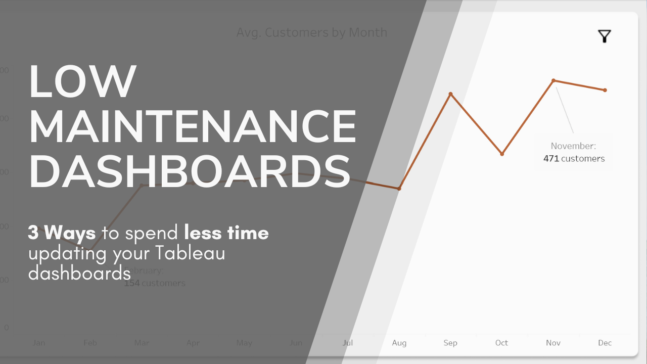
I try to avoid making super generalized statements about dashboard development, but here’s one: Manual maintenance on dashboards is not good. (By ‘manual maintenance’, I mean anything that requires you to periodically come back to the dashboard to change values, update calculations, edit visuals, etc, just to keep it working.)
It can’t always be avoided, and it’s not always a big deal, but it’s a net negative. It eats up time that could be used for new work, and it’s an opportunity for error to creep in. We may never be able to escape manual maintenance, but here are three ways to reduce it.
1. Avoid Hard-Coding Values
The number one way to reduce dashboard maintenance is to get rid of hard-coding. Whenever possible, avoid using specific values in your calcs. If you’re using a hard-coded value and that value ever changes, you’ll need to go through every calc in your dashboard to find where you’ve used it, and modify them. That takes time, and it’s easy to miss one and create error.
Instead, use the data source and Tableau’s built in functions to define values. This is especially applicable for dates, which are one of the most common hard-codings that I see in dashboards, and often have to be updated every year, or even more often. Using built-in functions like TODAY() can let you define dates relatively, instead of fixing it in a way that will need to be manually updated.
Here’s an example using filters and dates. (This is a setup that newer Tableau users often create, and one of the most common examples of unnecessary dashboard maintenance.) Let’s say you’re building a dashboard – I’m using old superstore data here – but you only want to show data for the current year. We’ll pretend it’s currently 2017, so you filter the data by year, and select 2017. Problem solved, right?

The problem here is pretty obvious. As soon as it becomes 2018, you’ll have to go back into the dashboard and change the filter to 2018. The dashboard will be useless until you update it. If you have more than one date filter, or use dates in any calcs, you’ll have to catch all of them or have a broken dashboard.
So what’s a better way to do this? Let’s look at how to use a calculated field to do this instead:

This calculation uses the very useful TODAY() function to get the current date, finds the year component, and then matches it to the year of the order date. If you place this calc on the filter pane and select ‘TRUE’, you’ll get only values that are from the current year.
Here’s another calc that achieves the same thing:

In this calc, we’re assuming that the largest year in the dataset will be the year we want to show (either because it’s the current year or the latest available), so we use a LOD calc to find the overall maximum, and select all the data from the matching year.
There are other ways to accomplish the same goal, but the consistent thread is that none of these methods rely on a specific date. As time moves on and data changes, the dashboard will stay up to date without any manual input.
In situations beyond just dates, look back to your data source to see what you have to work with. Can you match values between fields, or use a maximum value? Do you want to only use data from a specific year, or that matches data from a certain person? If you have hardcoded values (like a launch date for a product, for example), can you add those into the data source as a column instead of entering them into the dashboard?
2. Use The Power of Parameters (Or Groups, or Cascading Calcs)
Ideally, if you need a value to use in your calcs, you can create it using functions or pull it from the data source. But sometimes, that just isn’t realistic. If you have a hard-coded value that must be introduced on the dashboard side, your best choice is to make sure you only have to update it in one place. I usually like using a parameter to do this, because it makes it really easy to find anything that needs updates, but you also do this by using a single group or a single calc, and then referencing that group or calc in every other calculation and place that needs the value.
Here’s what that might look like with a parameter. In this example, I’m building a dashboard with sales data. Let’s say that I want September 6th, 2024 to be a focus date for my dashboard (maybe it was the latest introduction of a new product), and I want to reference that date in several places.
I want to:
-Filter both order date and ship date to after September 6th on several sheets
-Add color coding so that September 6th is highlighted on other sheets
-Adjust the name of a product subcategory if it was sold after September 6th.

That focus date is currently being used in four places (2 filters, one calculated field, and a color legend). If we ever get a new focus date, perhaps if a new product launch occurs, I would have to update the date in all four places. This is a simple example (and a little contrived because of how simple the data source is)0, but more complex dashboards can easily end up with the same value being used in 5, 10, or more places across calcs and filters.
Here’s how you fix it:
1. Create a parameter and set it to the hard-coded value (9-6-24, in this case). This parameter won’t be changed by the user, and won’t be visible to them.

2. Replace the value with the parameter in any calculated fields
3. Replace direct filters with a true/false field, like this (set the filter to True):

4. Do the same for any color/size/style fields.
Once this setup is complete, all we have to do to update the dashboard is to change once parameter, and all the other changes will cascade through. This isn’t the only way to accomplish the same goal, but it’s one of the cleanest. The big idea here: If you’re going to have to update values manually, make sure you only have to update them once.
3. Keep Your Visuals Flexible
Have you ever done this? You have a nice graph like this one, but you’d really like there to be a little more space between the bars and the top of the axis so that you have room for labels.

It’s so tempting to take the easy fix and just go in, edit the axis, and make it a bit higher.

If you want a low-maintenance dashboard, this is a bad, bad idea. (Actually, it’s just a bad idea most of the time). If you ever get values coming into your dashboard that are just a little bit different than what you have right now, you’ll have a cut-off, useless graph.
You might encounter a similar problem any time you’re setting a graph axis, defining histogram bins, lining up matched charts, setting reference lines, or formatting tables. If you use fixed values to format your visuals, you’re setting yourself up for maintenance down the line if your data ever becomes more varied.
Here’s how you could avoid this trap with the chart I showed above.

1. Create a calculated field that finds the maximum bar height (use the x axis values in a LOD to correctly calculate this), and then increases it by a percentage (10% in this case) to give a buffer zone.
2. Add the calculated field to the details pane, and then add it to the chart as a reference line. (Set the aggregation to total).
3. Open your chart axis editor, and make sure the axis is set to automatic.
4. Right click the reference line and format it to be invisible by removing the line display, label, and tooltip.
By using an invisible reference line with a field that’s based on the data itself, not on a fixed number, your chart will always show an appropriate buffer. Even if the data changes, you won’t have to come back and update anything – the dashboard will stay up to date by itself.
Leave a Reply