K12: Engagement Survey

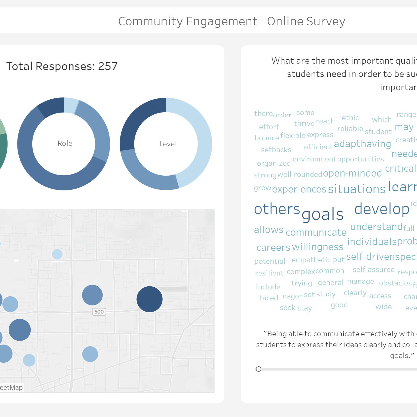
A thumbnail of a tableau dashboard showing community engagement survey results
,

View on Tableau Public

This dashboard visualizes results from a community engagement survey for a school district. (For demonstration purposes, this is using generated sample data, not real answers or demographics.) The word cloud on the right is fully filterable by clicking any segment or map dot on the left. For more about this technique, check out my article on the subject here.
Let’s keep in touch! New tips, tricks, and tutorials are posted about once a week – sign up to get them straight to your inbox!

I don’t spam! Read the privacy policy for more info.

One response to “K12: Engagement Survey”

  1. […] use donut charts frequently for showing demographic data – here’s an example of using donut charts to show demographic data on my K12: Engagement Survey […]

Leave a Reply

Your email address will not be published. Required fields are marked *